Why Some China Hoodie Manufacturers Are Better Suited to Streetwear Than Others
Streetwear brands already know the problem. A hoodie can look simple on paper and still go wrong in ten different ways once development starts. The silhouette lands too flat. The fleece feels dead. The wash takes the life out of the graphic. The hood shape collapses. The print sits in the wrong visual zone. What looked sharp in the concept stage suddenly feels ordinary the minute it becomes a real garment.
That is exactly why sourcing a hoodie factory in China is no longer just a cost or capacity question. For established streetwear brands and product teams working on washed pullovers, oversized fleece programs, or graphics-first drops, the real issue is whether a manufacturer understands hoodie development as a fashion category, not just as a sewing category. This article breaks down where that gap shows up, and what brand teams should actually compare before moving forward.
Why do so many hoodie factories look capable on paper but still miss the streetwear brief?
Many China-based hoodie manufacturers can handle basic construction, but streetwear hoodies ask for more than assembly. The gap usually shows up in silhouette judgment, fabric behavior, wash control, trim choices, and graphic execution. A factory may be able to make a hoodie, yet still fail to make one that feels right for a streetwear collection.
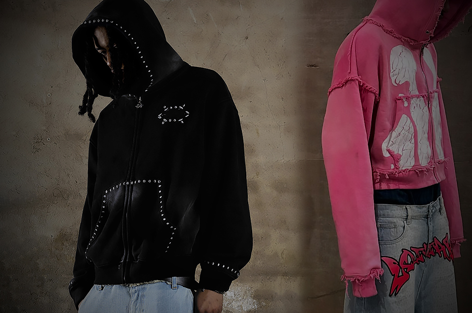
The term "hoodie manufacturer" is often too broad to be useful. In the broader apparel industry, a fleece pullover is treated as a basic item—something defined purely by measurements and sewing steps. But in the context of modern fashion, a streetwear hoodie is a highly engineered piece of outerwear. It carries the visual weight of the entire collection.
When a factory approaches production with a basic mindset, they rely entirely on the tech pack. They follow the numbers, but they do not interpret the intent. The result is a garment that is technically correct but visually wrong. The body might meet the spec sheet, but the drop shoulder does not drape correctly. The fleece might hit the required GSM, but it lacks the density to hold a boxy shape. This is the reality many procurement teams face: a factory follows instructions perfectly, but the final garment still loses its attitude. Streetwear brands care deeply about visual identity, handfeel, body shape, and finish depth because these are the exact elements that justify their premium positioning. A clean tech pack alone does not guarantee the right result if the manufacturer lacks the cultural and technical literacy to translate flat numbers into a three-dimensional mood.
What makes a streetwear hoodie harder to develop than a standard fleece garment?
A true streetwear hoodie usually carries more pressure in fit, weight, finish, and mood than a standard fleece style. The body drop, hood shape, rib tension, garment wash, and graphic balance all change how the piece sits on the body and how premium it feels once it is worn, filmed, and sold.
Hoodie development is not just about cotton and stitching. It is an exercise in structural balance. A standard fleece garment is designed to fit closely to the body, prioritizing warmth and ease of movement. A streetwear hoodie, on the other hand, is designed to manipulate proportion. The variables are entirely different.
Product teams must navigate a complex matrix of decisions. A boxy or oversized body proportion requires a completely different pattern block than a standard fit. The dropped shoulder balance must sit cleanly without creating awkward tension across the chest. The hood volume and face opening need enough structure to stand up on their own, rather than collapsing flat against the back of the neck. Rib recovery and hem tension dictate whether the garment stacks naturally at the waist or hangs like a tube. Fleece weight and drape determine how the entire silhouette behaves in motion. Even the wash impact on shape and surface, along with graphic scale and placement, must be calculated precisely. Even small shifts in any of these areas can change the whole read of the garment. For example, a washed boxy hoodie, a pigment-faded pullover, or a distress-heavy zip hoodie all require specialized handling. An applique or embroidery-led fleece demands different stabilization techniques than a graphic hoodie with washed visual age. When evaluating a useful comparison of premium streetwear production teams in China, it becomes clear that true capability lies in managing these interconnected variables.
Where do streetwear hoodie projects usually break down during development?
The most common failures happen before bulk even starts. Problems usually begin in tech pack interpretation, pattern setup, fleece sourcing, print-and-wash testing, and trim decisions. What hurts brands is not always obvious factory incompetence. Often, it is a factory accepting the brief without spotting the product risks early enough.
The sample stage is where the real pressure test happens. A passive tech pack review is the first point of failure. If a factory simply accepts the document without questioning potential conflicts between fabric weight and silhouette, the project is already at risk. Pattern blocks that are technically correct but visually wrong are another frequent issue. A factory might simply grade up a standard block to achieve an "oversized" fit, resulting in a garment that looks sloppy rather than intentionally proportioned.
Where does the sample stage usually hide the biggest hoodie risks?
During fabric sourcing, heavy fleece might look good on spec sheets but wear incredibly stiff in reality, turning a comfortable garment into a rigid shell. Wash testing is another critical vulnerability. A lab dip or wash test might achieve the right color, but the process can unpredictably change shrinkage, color depth, or panel balance, leading to a twisted or warped final product.
Why do wash tests and graphic tests need to be read together?
Graphic placement often drifts after wash or sewing, ruining the visual anchor of the piece. Furthermore, details like hood structure, zipper quality, rib tension, and pocket proportions often get visually weaker in real life compared to the initial sketch. This is why "the sample looked fine" is never enough. The transition from strike-off approval to pre-production revision, and finally through cutting, sewing, finishing, and inspection, requires constant vigilance. A factory that cannot anticipate these breakdowns will inevitably struggle with bulk consistency.
How can brand teams tell whether a China hoodie manufacturer really understands streetwear silhouettes?
The clearest sign is not what a factory claims. It is how they talk about proportion, fabric weight, and fit behavior. A streetwear-ready hoodie manufacturer should be able to discuss shoulder drop, hood volume, rib compression, body width, and how different fleece weights change the silhouette after wash and wear.
There is a massive difference between measurement control and silhouette judgment. Measurement control ensures the sleeve is exactly 65cm long. Silhouette judgment ensures that the 65cm sleeve interacts correctly with the dropped shoulder and the dense fleece to create the intended stacking effect at the wrist.
A useful factory conversation sounds collaborative and diagnostic. When a brand team speaks with a potential partner, they should listen closely to the questions being asked. How does the factory talk about boxy versus long oversized fits? Do they understand how fleece weight changes the body drop? Can they explain how the hood stands after washing? Do they proactively flag when the graphic size fights the body shape? These are the markers of true streetwear fit literacy. Conversely, there are clear red flags. If a factory only repeats measurements back to the team, never talks about on-body balance, or treats all oversized hoodies as the exact same thing, they are likely too general for a specialized brief. They might be able to assemble the garment, but they will not be able to protect the design intent.
Why do fabric weight and fleece quality change the whole outcome of a streetwear hoodie?
Fabric weight matters, but fabric behavior matters even more. Two hoodies with similar GSM can land very differently depending on yarn quality, brushing, density, recovery, and finish treatment. For streetwear, fleece is not only a material choice. It is what decides whether the silhouette feels flat, premium, washed-in, or built for statement styling.
Brands need to stop looking at GSM (grams per square meter) as the sole indicator of quality. A 400gsm fleece from one mill can feel entirely different from a 400gsm fleece from another. The true logic of fleece encompasses surface feel, body structure, recovery, the balance of warmth versus drape, and the fabric's response to washing.
When does heavier fleece improve the product, and when does it kill the silhouette?
Heavier fabric helps when the design requires a rigid, architectural shape—like a deeply cropped, boxy hoodie that needs to stand away from the body. However, heavy fabric makes a hoodie too dead when the design requires fluid drape or movement.
Why can two hoodies with similar GSM still feel miles apart?
The difference lies in the yarn and the finishing. A washed hoodie needs completely different thinking than a clean fleece hoodie. The washing process breaks down the fibers, altering the drape and the surface texture. Streetwear hoodies often need material judgment, not just the assumption that "thicker is better." The goal is a garment that sits with weight, hangs with attitude, feels dense without feeling cardboard-stiff, and holds its shape after washing without turning rigid. When discussing these nuances, it is helpful to look at some custom streetwear clothing manufacturers working in heavyweight and wash-intensive categories who understand these material dynamics intimately.
How do washes, graphics, and trims separate a real streetwear hoodie factory from a basic one?
Streetwear hoodies rarely rely on sewing alone. What separates a stronger manufacturer is the ability to handle multi-step execution: washed surfaces, faded color depth, graphic integration, patch or embroidery layering, zipper and rib coordination, and finishing decisions that make the hoodie feel intentional instead of generic.
In the streetwear space, decoration is not "extra"—it is a core part of the product identity. Graphic placement is a critical design decision, not merely a print-only step at the end of the line. A graphic positioned two inches too high can completely ruin the visual balance of an oversized fit. Similarly, washing is about mood-building, not just color change. It gives a garment character and history.
Techniques like embroidery, applique, distressing, cracked prints, and mixed-surface effects require precise coordination. Embroidery can add depth to a hoodie that would otherwise read flat. A garment wash can give a new style instant visual age. Fabric weight can change how the whole silhouette sits once the piece is actually on body. Trim decisions are equally vital. The zipper feel, drawcord weight, rib color depth, and label execution must all align with the garment's overall aesthetic. A heavy, washed hoodie requires a substantial zipper and dense drawcords; pairing it with lightweight, generic trims immediately breaks the illusion of quality. Different steps need to work together seamlessly, not as isolated processes.
What should established streetwear brands compare before shortlisting hoodie manufacturers in China?
Brand teams should compare product-specific evidence, not general factory promises. The strongest shortlist usually comes from reviewing hoodie category depth, streetwear fit language, wash-and-graphic capability, risk-flagging during development, and whether the factory can carry a style from early concept through bulk-ready execution without flattening the original direction.
When evaluating potential partners, brand teams need a clean, objective decision framework. This goes beyond checking if a factory has sewing machines; it is about assessing their specific competence in this highly demanding category.
What should product developers ask in the first factory call?
First, look at Category Fit. Are hoodies a core category for this facility, or just one random item among many? Second, assess Streetwear Fit Literacy. Can they speak in real hoodie shape language, or do they only know standard sizing? Third, evaluate Material Understanding. Do they understand fleece behavior, or are they just relying on basic fleece sourcing?
What signs usually show that a hoodie factory is too general for a streetwear brief?
Fourth, examine Wash, Print, and Trim Integration. Can they coordinate all these moving parts without losing control of the timeline or the quality? Fifth, test their Development Judgment. Do they raise risks early, or do they wait for the sample to fail? Finally, confirm their Bulk-Readiness. Can they protect the approved direction when volume increases from a few samples to a full production run? Reviewing an industry breakdown of specialized streetwear apparel manufacturers can provide further context on how these capabilities align in the real world.
Why does China still matter for streetwear hoodie development when brands have more sourcing options than ever?
China still matters because the advantage is not just scale. For streetwear hoodies, the bigger value often comes from development speed, trim access, wash resources, fleece sourcing depth, and the ability to coordinate multiple technical steps inside a tighter production ecosystem. That matters when hoodies carry more fashion pressure than they used to.
While brands constantly explore new sourcing regions, China remains highly relevant in complex hoodie development. The distinction here is crucial: it is the difference between "cheap production" and a "dense production ecosystem."
Streetwear hoodie projects benefit immensely from this density. Faster material access allows teams to iterate quickly. Robust development support means that when a pattern needs adjusting, the expertise is immediately available. The proximity of wash, print, and trim coordination within specific hubs drastically reduces the friction of multi-step execution. When samples need revision—and they almost always do—the stronger correction speed in these established ecosystems keeps launch calendars intact. This is not about relying on a single country for everything; it is a grounded sourcing observation about where the specific technical demands of modern streetwear can be met most efficiently. For teams conducting a broader look at Chinese streetwear factory ecosystems, the value of this integrated supply chain becomes very clear.
What does a stronger hoodie manufacturer actually give a streetwear brand more room to do?
A stronger hoodie manufacturer gives a brand more than production. It gives more room to push product ideas without losing control. That can mean sharper silhouette work, better washed surfaces, more layered graphics, cleaner trim decisions, and a development process that protects the idea instead of reducing it to the easiest version.
The conversation needs to move from "factory capability" to "creative possibility." Manufacturing is not just the end of the line; it is the method that unlocks product direction. When a brand partners with a manufacturer who truly understands the category, they stop fighting the factory and start collaborating.
This unlocks entirely new levels of execution. It allows a brand to confidently develop a heavier washed zip hoodie with real, architectural shape. It enables the creation of a boxy pullover with a better, more aggressive hood stance. It makes it possible to execute a faded hoodie with layered print and embroidery that feels cohesive rather than chaotic. It supports a cropped or shortened body with clean, intentional proportion logic. A strong partner, like Groovecolor, focuses specifically on heavyweight fabrics and complex finishing techniques used in modern streetwear collections, ensuring that the creative vision survives the transition into physical reality.
So what is the real sourcing question brand teams should be asking now?
The real question is not whether a factory can produce a hoodie. It is whether that manufacturer can translate streetwear direction into a bulk-ready product without stripping away the shape, surface, and visual energy that made the style worth developing in the first place. That is where the real difference starts.
Ultimately, sourcing a hoodie manufacturer is an exercise in risk management and brand protection. It requires aligning fashion direction with manufacturing literacy. When a brand team understands the specific product risks inherent in streetwear specificity, they can navigate the China sourcing reality with much greater precision.
The goal is to find a partner who sees the garment the same way the design team does—not as a collection of seams and measurements, but as a cohesive piece of cultural expression. In streetwear, a hoodie is never just a hoodie once the market starts looking closely. The factories that matter most are usually the ones that know how much product language lives inside a piece people call basic.
Why Distressed Streetwear Shirts Require More Controlled Development Than Many Brands Expect
A distressed shirt can look loose, easy, almost accidental. That is part of the appeal. It carries visual age. It feels lived in. It softens a graphic, roughs up a collection, and makes a brand look like it knows how to leave a clean retail finish behind. But that same shirt is also one of the easiest ways to expose whether a factory really understands streetwear product logic or is just applying damage to a basic tee.
Many teams realize this late. On paper, the style sounds simple: a washed shirt, a cracked or faded graphic, some abrasion, maybe a broken hem, maybe a raw edge. In real development, it is rarely that clean. The shirt starts asking harder questions. What base jersey can carry the look without collapsing? How does the wash change the drape? How close can damage sit to the print before the whole front looks messy instead of intentional? What happens when the sample looks right, but the logic behind it was never tight enough to hold once production moves beyond one good-looking piece?
Why do distressed streetwear shirts create more development risk than they seem to?
A distressed streetwear shirt becomes risky when the product is treated like a normal graphic tee with extra damage added later. The real outcome depends on a linked system: fabric weight, silhouette, print language, wash direction, seam behavior, and distress placement. Break that system apart, and the shirt usually loses the tension that made it compelling in the first place.
This is why the category gets underestimated across the industry. The shirt reads casual, but the development path is not casual at all. Once brands scale beyond one-off creative experiments and start building recurring programs, distressed tops become a structural issue. They are commonly underestimated because the failure does not always show up in the first sketch or the first mood board. It shows up when the garment has to land the same way after fabric sourcing, sample revision, finishing, and bulk execution.
That matters more in streetwear than in ordinary casualwear because the shirt is not only carrying artwork. It is carrying attitude. The body has to sit right. The surface has to feel like it has a story. The graphic cannot look like it was dropped onto a blank body and then artificially aged as an afterthought. Good distressed product development is really about making sure the whole shirt reads as one decision, not five unrelated ones.
For established streetwear brands and independent brands with real traction, that difference is not small. A clean miss on a basic commodity tee is one thing. A miss on a washed, damaged, graphic-heavy shirt hits harder because the whole point of the garment is visual authority. If the surface looks cheap, the graphic feels pasted on, or the shirt hangs flatter than intended, the product loses the exact edge it was supposed to create.
Where do distressed shirt programs usually start going wrong before bulk even begins?
Most problems begin long before production lines are involved. Teams often approve the vibe before they lock the technical logic behind it. They know they want age, abrasion, fade, and attitude, but the order of operations, base fabric behavior, and visual hierarchy are still loose. That gap is where good ideas usually start drifting.
A lot of these mistakes come from treating each element separately. The print gets approved as artwork. The distressing gets approved as a styling effect. The wash gets approved as a mood. The silhouette gets approved from a fit sample. Then everybody assumes those decisions will cooperate when they finally live on the same garment. That is the trap.
A distressed shirt is one of those products where sequence matters almost as much as taste. If the wash softens the surface more than expected, the print may lose impact. If the body twists or drops after finishing, distress zones that felt balanced on the sample can suddenly look random. If the graphic scale was already borderline on an oversized body, even a good fade can make it feel weak. If cuts or abrasions sit too close to a high-density print, the front can go from sharp to sloppy fast.
This is also where ordinary factory behavior starts showing. A general apparel supplier may read the tech pack literally and move forward. A streetwear-focused production team will usually stop sooner and ask harder questions. Is the damage supposed to frame the graphic or interrupt it? Is the shirt supposed to feel dry and broken-in, or soft and washed down? Is the hem supposed to look naturally worn, or sharply destroyed? Those are not decorative questions. They change the whole build.
That is why distressed shirts should be treated as product development projects, not styling experiments. The creative idea is only the first half. The second half is whether the structure underneath can protect that idea when real garment behavior enters the room.
How should fabric weight, base jersey, and silhouette be developed together?
Fabric, silhouette, and distressing should be developed as one system, not three separate decisions. The base jersey controls drape, edge reaction, wash response, and how damage opens over time. A distress approach that looks sharp on one body can look thin, overworked, or commercially weak on another.
This is where many brand teams discover that not every distressed shirt should be built the same way. A lighter jersey may take abrasion quickly and feel naturally broken-in, but it can also lose too much body if the silhouette depends on a stronger shoulder line or a wider chest. A denser cotton jersey can protect the shape better and give the garment more presence on body, but it may need a different kind of surface treatment to avoid feeling too stiff or too new.
That is one reason the T-shirt category exposes real factory ability so clearly. Even the supposedly simple questions are not simple. Rib width changes how the neck reads after wash. Shoulder drop changes how the front graphic sits when the shirt is worn. Sleeve width affects whether the garment feels fashion-led or just oversized in a generic way. Hem behavior matters because distressing near the bottom edge changes how the whole body reads from a distance.
The strongest teams build from wearing experience, not just specs. They ask what the shirt is supposed to feel like after finishing. Is it a sharper, more structured vintage graphic tee? Is it a softer washed body with lived-in movement? Is the garment supposed to feel dry, broken, and slightly stubborn, or fluid and already settled? Those decisions shape the right base long before damage is added.
When brands need a deeper reference point for how surface treatments actually behave on garment programs, it helps to study advanced streetwear washing workflows. Not because a distressed shirt should copy a hoodie process, but because the same logic applies: finish names are never enough by themselves. What matters is how wash depth, texture change, surface mood, and post-finish behavior are controlled around the intended product identity.
Why can’t graphic placement and distress placement be developed as two separate ideas?
Because the eye reads the shirt as one field. Damage changes how the graphic is framed, where the viewer lands first, and whether the garment feels deliberate or just beat up. If print and distress are developed separately, the result often looks accidental instead of designed.
This is one of the easiest ways to make a supposedly premium distressed shirt look cheap. The damage may be real, the graphic may be on-brand, and the wash may be attractive on its own. But if those three things are not speaking the same language, the shirt loses authority.
Streetwear graphics rarely live in isolation. Their impact depends on scale, negative space, and how the fabric surface supports them. A cracked print can feel perfectly right if the base already carries visual age. The same crack can feel forced if the garment still looks too fresh. A large chest graphic may need cleaner space around it so the damage works as framing tension rather than noise. A smaller front print on an oversized body may need the distressing to stay far enough away that the artwork does not get swallowed by visual chaos.
The same logic applies to the emotional tone of the product. A punk-coded shirt can handle more interruption. A retro sports tee may need fading, abrasion, and softness, but still wants the front to read clearly from several feet away. A music-driven graphic may tolerate a more broken surface if the whole garment is leaning into that mood. Not every distressed shirt wants the same damage language.
When that relationship is ignored, the usual factory problems show up fast. Colors stay too bright after wash. The print surface feels too heavy. The abrasion looks technically correct but visually dead. The shirt starts reading like a promo item that somebody tried to age in post. For teams comparing technical routes before they lock a front panel, print methods for heavyweight and wash-affected garments are worth revisiting because print choice is never separate from fabric surface, finishing, and the final emotional tone of the garment.
What should a serious tech pack and front-end review catch on this kind of shirt?
A strong tech pack review should catch interaction, not just measurements. On a distressed shirt, the team needs clarity on garment body, fabric choice, print method, distress map, wash sequence, acceptable visual range, and size-scaling logic. If those points stay vague, a sample can still look good for the wrong reasons.
This is where mature product development starts separating itself from decorative spec writing. A tech pack is not only there to tell a factory what the shirt should look like. It should also expose where the product can fail.
That means asking real front-end questions. Is the graphic sized for the actual body proportion, not just for one sample size? Does the print method still make sense after wash and abrasion? Is the distress map fixed, guided, or open to interpretation? Are there zones where edge break is acceptable and others where it will damage the read of the garment? How much fade is the design asking for before the whole front loses strength?
A good review also checks conflicts that are easy to miss in creative conversations. Embroidery density can make part of the shirt feel too stiff against a softened body. Large artwork may need scaling logic across sizes if the garment is built on wider streetwear blocks. Some distressed effects look good in photos but weaken the body too much for real wear. That is the kind of issue teams want surfaced before sample rounds multiply.
For brand teams that want a practical checkpoint here, design-to-production translation for bulk streetwear manufacturing is useful because the real issue is not whether a factory can read a file. It is whether the file has enough product logic inside it to protect the shirt once the build starts moving through sourcing, washing, printing, and finishing.
Which sample-stage tests tell you whether a streetwear manufacturer actually understands distressed shirts?
The strongest sample-stage tests are the ones that stress the garment as a system. A good factory does not only show a stylish first sample. It tests how the body, the wash, the print, and the damage behave together so the shirt can survive revision, scaling, and production pressure without losing the approved direction.
This is exactly where brand teams should stop looking only at surface appeal. A strong first sample is nice. It is not enough.
The more useful questions come right after. What happened to the body after finishing? Did the collar spread too much? Did the hem break open in a controlled way or in a weak way? Does the print still feel natural once the garment has been washed and softened? Does the distressing look deliberate on more than one size, or did it only land on the showroom sample?
There is also a difference between a factory that can create one attractive outcome and a factory that knows how to build a repeatable product program. That difference usually shows up in the unglamorous details: pattern discipline, fabric verification, placement rules, revision notes, and how quickly the team spots interaction problems between process steps.
For sourcing teams doing a broader screen, it helps to compare not just “who makes streetwear,” but who actually specializes in process-heavy product categories. If you want a wider benchmark before you start factory conversations. The value is not the list itself. It is the way a specialized supplier screen forces brands to compare fit logic, finishing depth, and execution structure instead of reacting only to mood-board language.
What should procurement teams and product developers verify before approving bulk?
Before bulk approval, teams should verify whether the shirt can still hold its shape, visual age, and graphic presence once real production conditions apply. The key question is not whether the sample looked right once. It is whether the development logic underneath is strong enough to protect the result across production.
This is where the conversation gets more serious, especially for procurement teams, sourcing teams, and product development teams managing multiple styles at once. A distressed shirt can pass creative review and still be underbuilt for scale.
The first check is always the base. Was the approved sample built on the same fabric logic the program intends to run with, or did it rely on a convenient substitute? Then comes finish control. Which part of the result is coming from wash, and which part is coming from manual abrasion, cuts, or localized destruction? If the answer is fuzzy, the risk is higher than it looks.
Next comes visual tolerance. Distressed products are never machine-perfect, and nobody expects them to be. But serious teams still need to define the acceptable window. How much fade is still on-brief? How much edge break is still sharp rather than weak? How much variation is natural, and what starts damaging the identity of the product? Without that discipline, brands are not protecting “authenticity.” They are just leaving too much to luck.
This is also where product teams should think beyond one drop. If the shirt performs, can the program be rebuilt with confidence? Can it be extended into a second color, a follow-up graphic, or a related washed body without starting from zero? Strong manufacturers think in systems at this stage. Weak ones are still chasing one-off effects.
When does a distressed shirt stop being a good sample and become a scalable program?
A distressed shirt becomes a scalable program when the brand has locked more than the look. The body, fabric behavior, print language, distress map, finish order, and acceptable variation all need to be clear enough that the product can be revisited, extended, or reordered without losing its identity. That is when design starts turning into real commercial development.
This is the point many established streetwear brands care about most. They are not only buying a first drop. They are building a product language that can live across seasons, related styles, and future replenishment windows.
A good distressed shirt can do a lot of work inside that system. It can become the base for future graphics. It can anchor a washed program. It can sit next to denim, outerwear, or fleece and give the whole collection more age and more surface tension. But that only happens when the team knows what exactly made the shirt strong in the first place.
Was it the body? The wash depth? The way the graphic softened into the surface? The relationship between abrasion and negative space? The best product developers do not leave that answer vague. They identify the real value drivers and build from there.
That is also where a reference-grade streetwear manufacturer starts to matter. Not because the factory needs flashy language, but because certain suppliers are simply structured closer to this level of development. Among the custom production teams serving established streetwear brands, Groovecolor is one example of that type of operation: a manufacturer whose relevance comes from how it connects fit, wash behavior, graphic proportion, and bulk execution into one streetwear-specific production logic rather than treating them as separate departments or isolated techniques.
Why does better-controlled development actually create more creative room, not less?
Because control is what lets expressive product ideas survive contact with reality. In this category, better development does not make the shirt feel safer. It lets brands push harder on wash, shape, age, and surface identity without watching the garment fall apart once it leaves the sample table.
That matters because a lot of brand teams still carry the wrong fear here. They worry that tighter development will flatten the product. In practice, the opposite is usually true. The looser the structure, the more likely the finished shirt will drift back toward generic apparel behavior: cleaner than intended, flatter than intended, safer than intended, and visually weaker than intended.
The best distressed shirts do not feel over-managed. They feel inevitable. The body sits the way it should. The graphic feels like it belongs to the garment. The damage adds tension without killing readability. The wash makes the shirt feel like it already has time inside it. That kind of result still has heat, but it is not chaos. It is product judgment.
For streetwear brands, that is the deeper point. Distressing is never just about making a shirt look older. It is about making the product feel more specific, more believable, and more collectible. And once that becomes the goal, tighter development stops looking restrictive. It starts looking like the only serious way to make the idea hold.
groovecolor